NCERT Solutions for Class 8 Maths Chapter 15 Ex 15.1
In this page we have NCERT Solutions for Class 8 Maths Chapter 15 Ex 15.1 for
Introduction to Graphs. This exercise has question about Line graoph, how to draw the line graph. Hope you like them and do not forget to like , social share
and comment at the end of the page.
NCERT Solutions for Class 8 Maths Chapter 15 Ex 15.1
Question 1
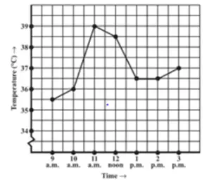
The following graph shows the temperature of a patient in a hospital, recorded every hour.
(a) What was the patient’s temperature at 1 p.m.?
(b) When was the patient’s temperature 38.5° C?
(c) The patient’s temperature was the same two times during the period given. What were these two times?
(d) What was the temperature at 1.30 p.m.? How did you arrive at your answer?
(e) During which periods did the patients’ temperature showed an upward trend? Answer: After studying the graph, we can easily answer these questions
(a) The patient’s temperature at 1 p.m. is 36.5°C
(b) The patient’s temperature 38.5° C happened at 12:00 Noon
(c) The patient’s temperature was the same at 1:00 PM and 2:00 PM
(d) The graph between 1 AM and 2AM is line parallel to x-axis. So temperature at 1.30 AM will be temperature at 1AM. So answer is 36.50
(e) Patients temperature showed an upward trend from 10:00 to 11:00 AM and from 2:00 to 3:00 PM
Question 2
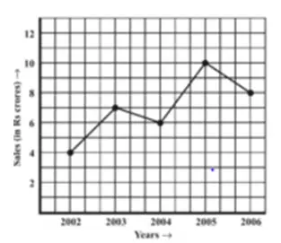
The following line graph shows the yearly sales figures for a manufacturing company.
(a) What were the sales in (i) 2002 (ii) 2006?
(b) What were the sales in (i) 2003 (ii) 2005?
(c) Compute the difference between the sales in 2002 and 2006.
(d) In which year was there the greatest difference between the sales as compared to its previous year? Answer:
(a) The sales of the manufacturing company was Rs. 4 crores in 2002 and Rs. 8 crores in 2006
(b) The sales of the manufacturing company was Rs. 7 crores in 2003 and Rs. 10 crores in 2005
(c) The sales in 2002 was 4 crore and in 2006 is 8 crore. So difference 8-4=4; Sales of 2006 is Rs. 4 crores more than that of 2002
(d) 2005 sees the greatest jump in sales which clear from the steepest angle between these years.
Question 3
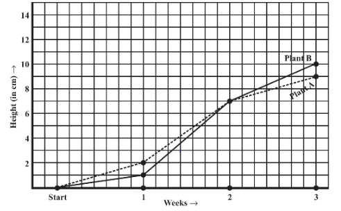
For an experiment in Botany, two different plants, plant A and plant B were grown under similar laboratory conditions. Their heights were measured at the end of each week for 3 weeks. The results are shown by the following graph
(a) How high was Plant A after (i) 2 weeks (ii) 3 weeks?
(b) How high was Plant B after (i) 2 weeks (ii) 3 weeks?
(c) How much did Plant A grow during the 3rd week?
(d) How much did Plant B grow from the end of the 2nd week to the end of the 3rd week?
(e) During which week did Plant A grow most?
(f) During which week did Plant B grow least?
(g) Were the two plants of the same height during any week shown here? Specify. Answer We can easily infer following from graph
(a)Plant A was high on (i) 7 cm (ii) 9 cm
(b) Plant B was high on (i) 7 cm (ii) 10 cm
(c) 2 cm
(d) 3 cm
(e) From week 1 to week 2 by 5 cm
(f) In the first week by 1 cm
(g)Second week both have a height of 7 cm
Important Question Question 4
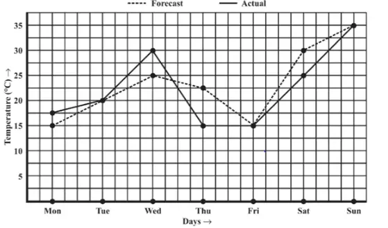
The following graph shows the temperature forecast and the actual temperature for each day of a week.
(a) On which days was the forecast temperature the same as the actual temperature?
(b) What was the maximum forecast temperature during the week?
(c) What was the minimum actual temperature during the week?
(d) On which day did the actual temperature differ the most from the forecast temperature? Answer:
(a)The forecast temperature the same as the actual temperature on Tuesday 20° C, Friday 15° C and Sunday 35° C
(b)The maximum forecast temperature during the week was 35° C
(c) The minimum actual temperature during the week 15° C
(d) Thursday, by 7.5° C (Notice the largest gap between two lines)
Question 5
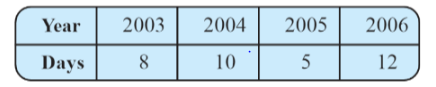
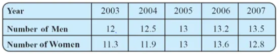
Use the tables below to draw linear graphs.
(a) The number of days a hill side city received snow in different years.
(b) Population (in thousands) of men and women in a village in different years. Answer:
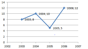
(a)
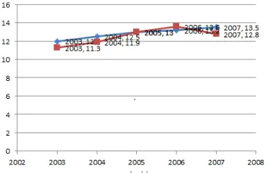
(b)
Question 6
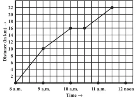
A courier-person cycles from a town to a neighboring suburban area to deliver a parcel to a merchant. His distance from the town at different times is shown by the following graph.
(a) What is the scale taken for the time axis?
(b) How much time did the person take for the travel?
(c) How far is the place of the merchant from the town?
(d) Did the person stop on his way? Explain.
(e) During which period did he ride fastest? Answer
(a) The scale taken for time axis is 1 hour
(b) 3.5 hours
(c) 22 kms
(d) Between 10:00 AM to 11:00 AM the line is horizontal, which explains that the person took rest between these timings
(e) Between 8:00 AM and 9:00 AM he traveled 10 kms, (look for the steepest angle made by the line)
Summary
NCERT Solutions for Class 8 Maths Chapter 15 Introduction to Graphs CBSE Exercise 15.1 has been prepared by Expert with utmost care. If you find any mistake.Please do provide feedback on mail. You can download the solutions as PDF in the below Link also Download Introduction to Graphs NCERT Solutions Exercise 15.1 as pdf
This chapter 15 has total 3 Exercise 15.1 ,15.2 and 15.3. This is the First exercise in the chapter.You can explore previous exercise of this chapter by clicking the link below